


Highlands Community Church
Branding Identity
I partnered with Highlands Community Church to create a new brand identity rooted in their mission and values. This included a full logo suite, brand typography and color system, and custom collateral for both digital and print — from way-finding signage and business cards to social media templates and a brand variation for their kids ministry.
The Brief
Highlands Community Church (formerly The West Milford Campus of The Plant Church) was started in February of 2020. After 6 years of partnership with their main campus, Highlands was launched as an independent church in January 2026 and they needed a rebrand.
The goal was to create a visual system that feels authentic, welcoming, and timeless—something that could live confidently across print, digital, and web applications.
The Concept
Every brand begins with a story.
The creative direction for this brand was inspired by Kinsugi (the Japanese art for repairing broken pottery) and stained glass. It centered on a clean aesthetic, calm tones, and the idea of individual pieces being brought together to form something beautiful and whole. From there, I built a visual language around typography with a timeless look, balanced composition, and an intentional color palette that reflects Highland’s authentic and trustworthy personality.
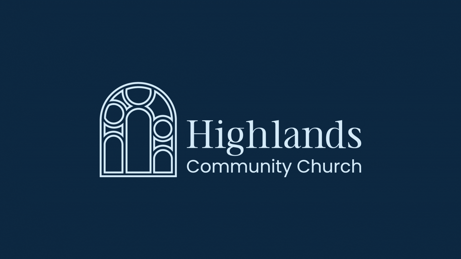
Logo Design
The Highlands logo was designed to be timeless and versatile, with variations built in to allow it to function seamlessly in both large-scale print formats and small digital applications.
The logo embodies a vision of wholeness, where individual pieces are brought together in harmony to create something beautiful and complete. Inspired by the art of Kinsugi and traditional stained glass windows, the logo reflects elements coming together to represent and communicate a larger message, much like the mission of Highlands Community Church.
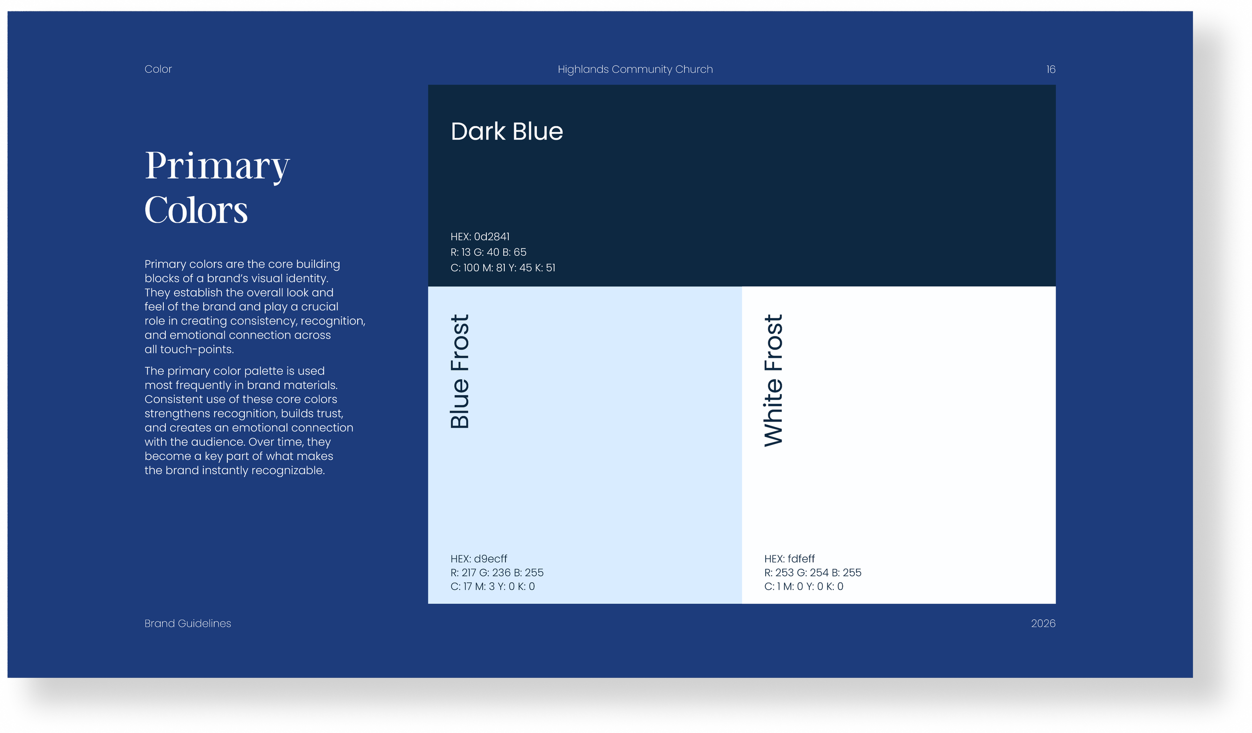
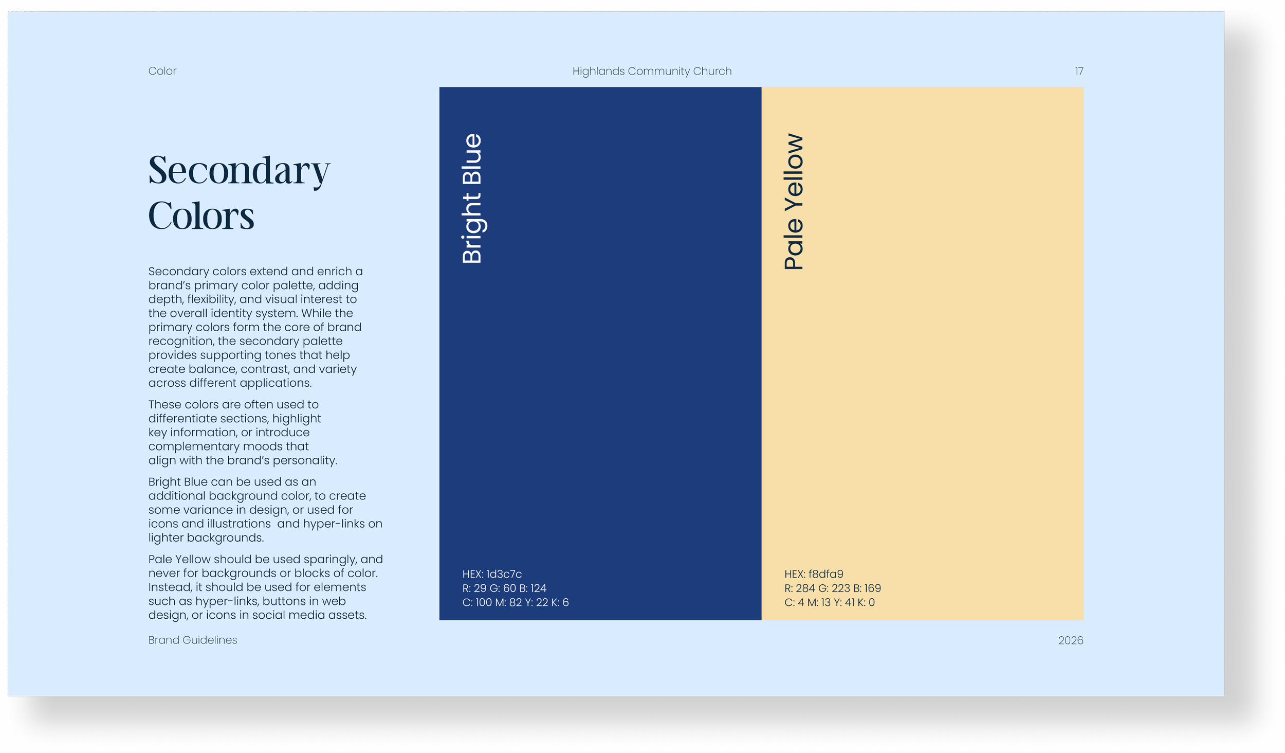
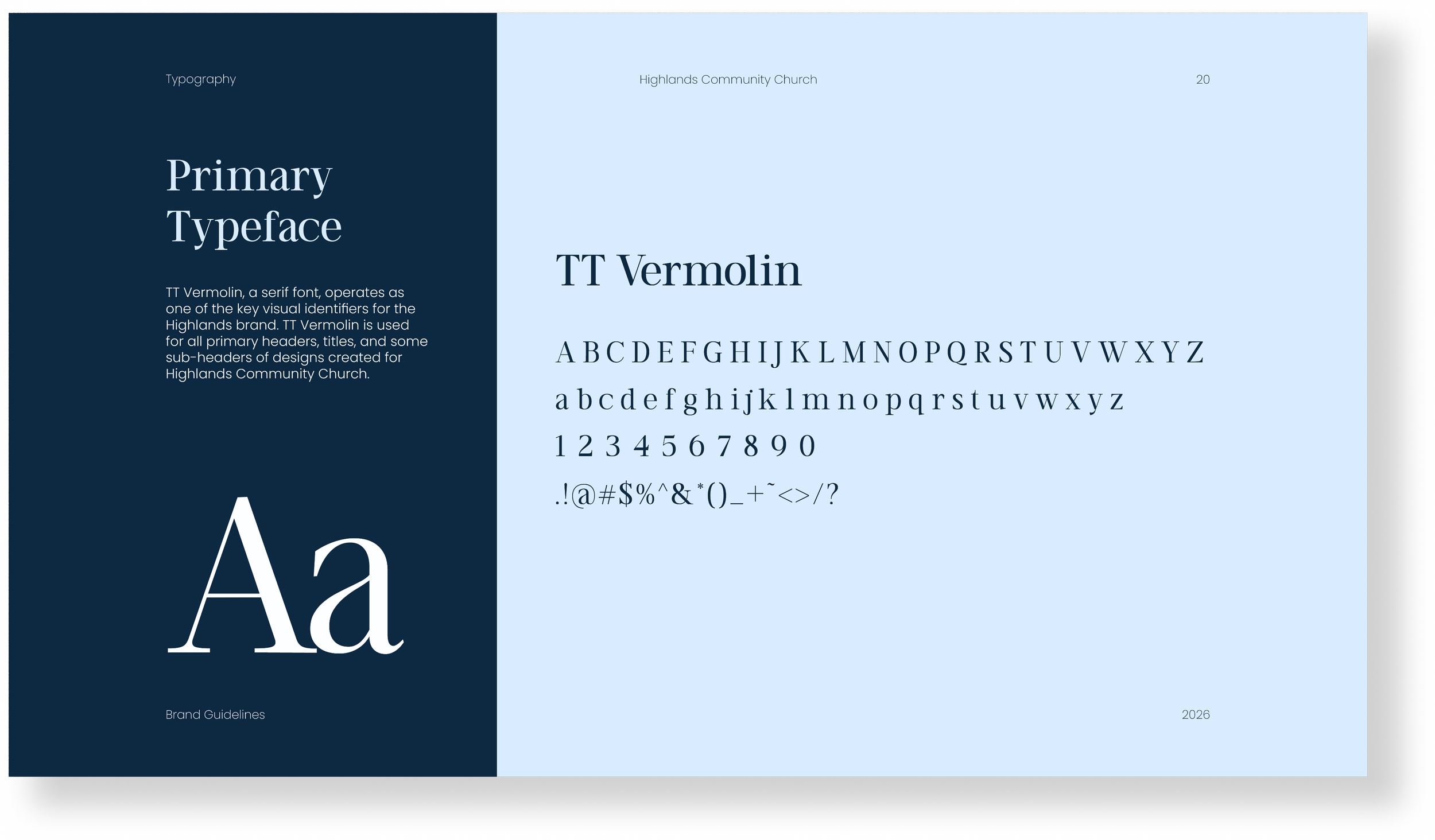
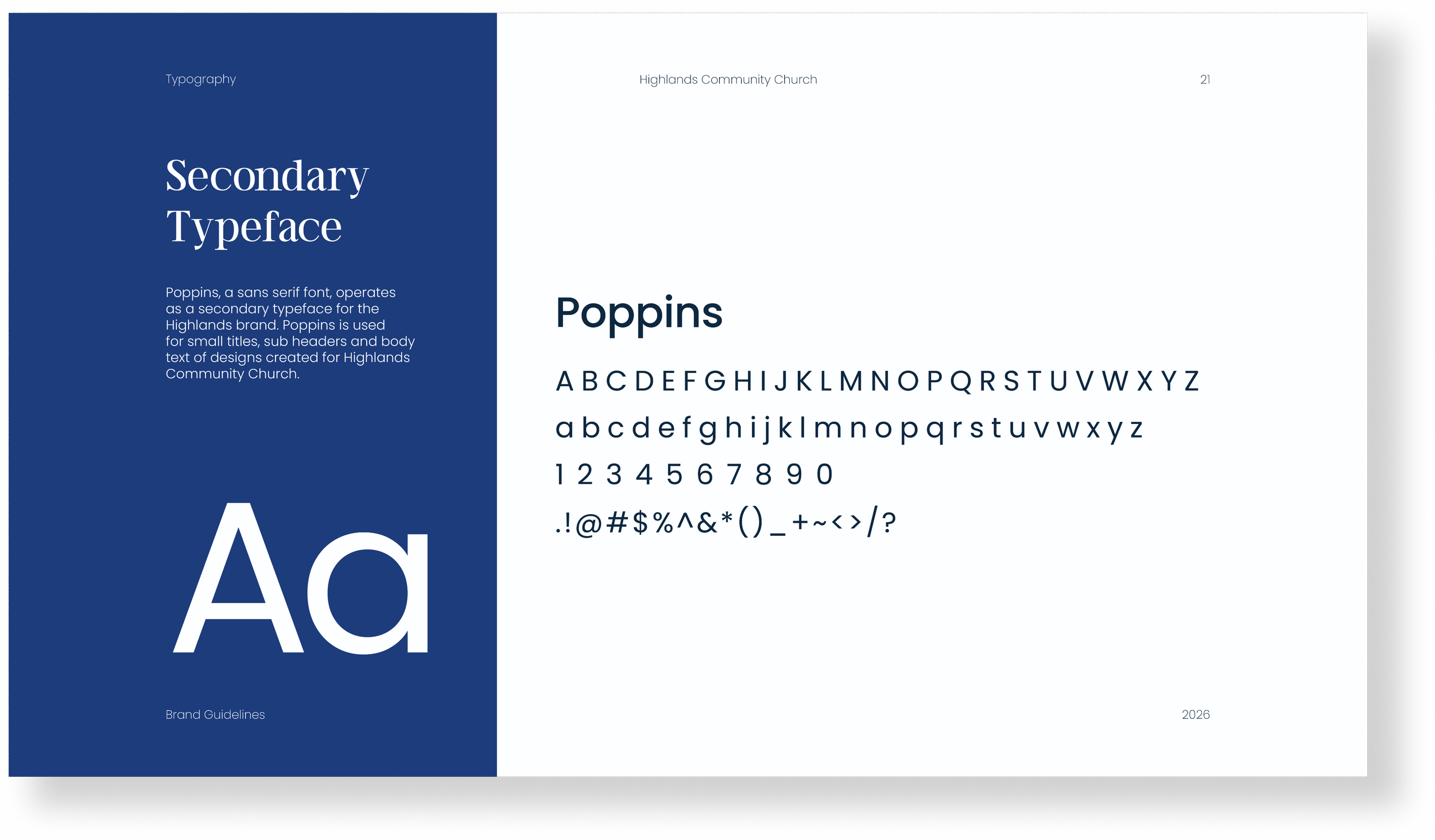
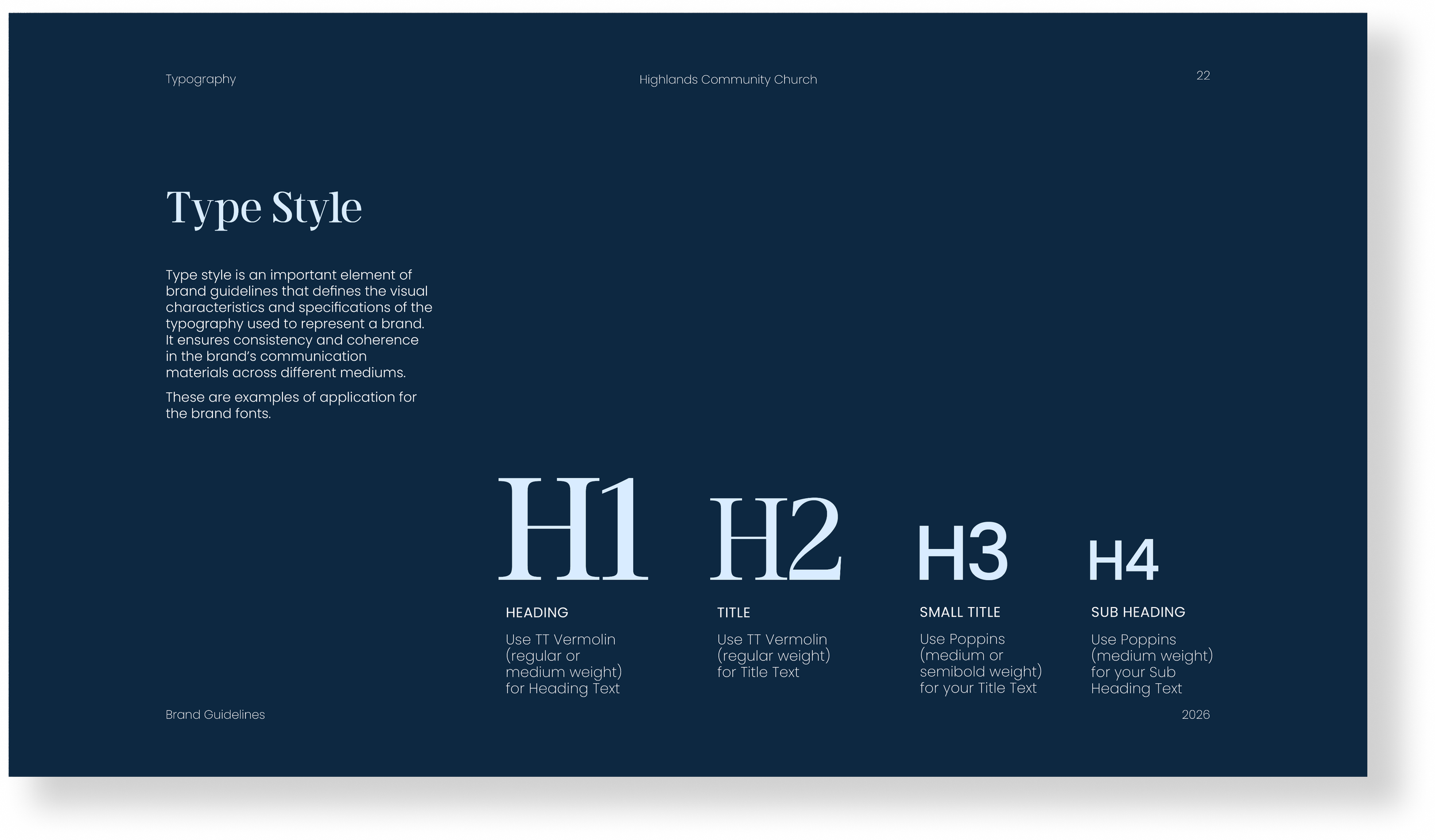
Color Palette & Typography
Consistency is key to brand recognition. The chosen colors blend a primarily monochromatic blue palette with a complimentary yellow to create a trustworthy and clean tone.
Typography choices complement the round elements of the logo and maintain readability across print and web, establishing hierarchy and harmony throughout the brand.
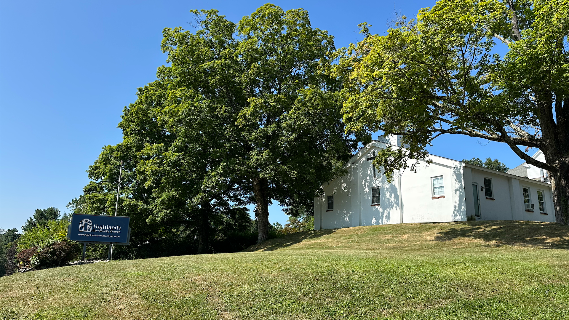
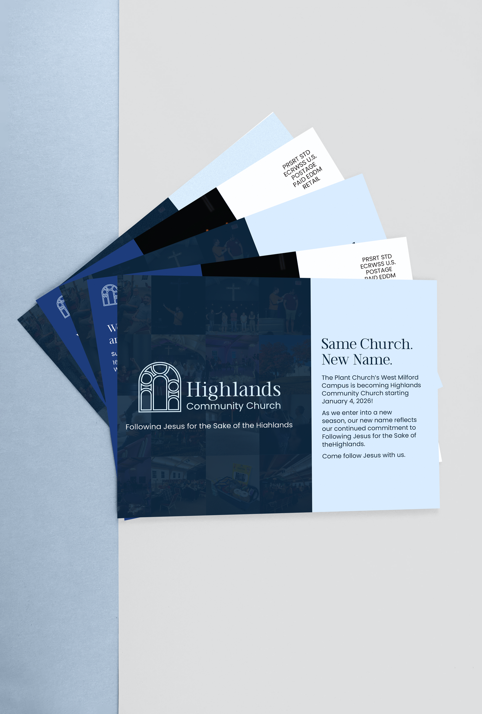
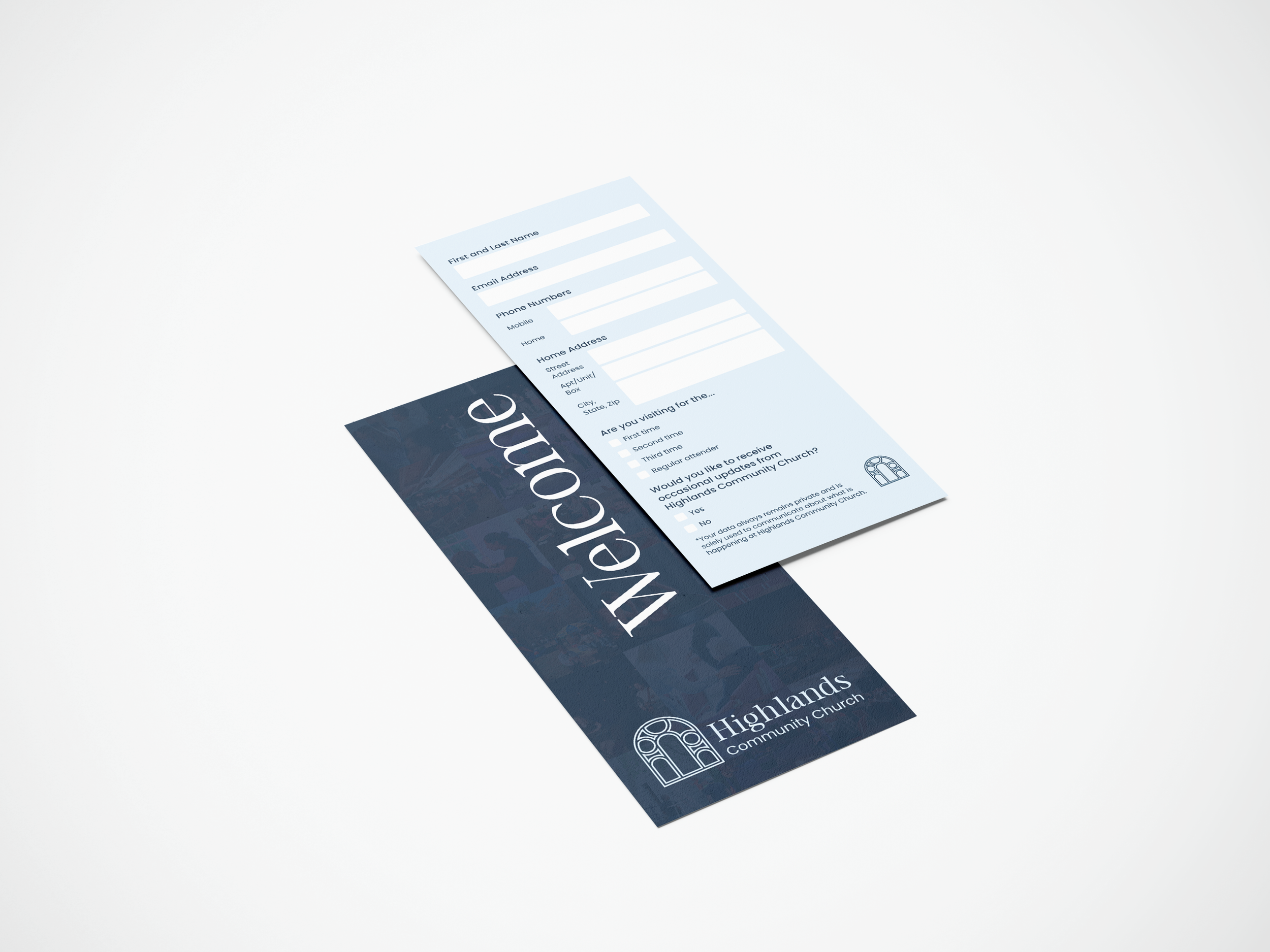
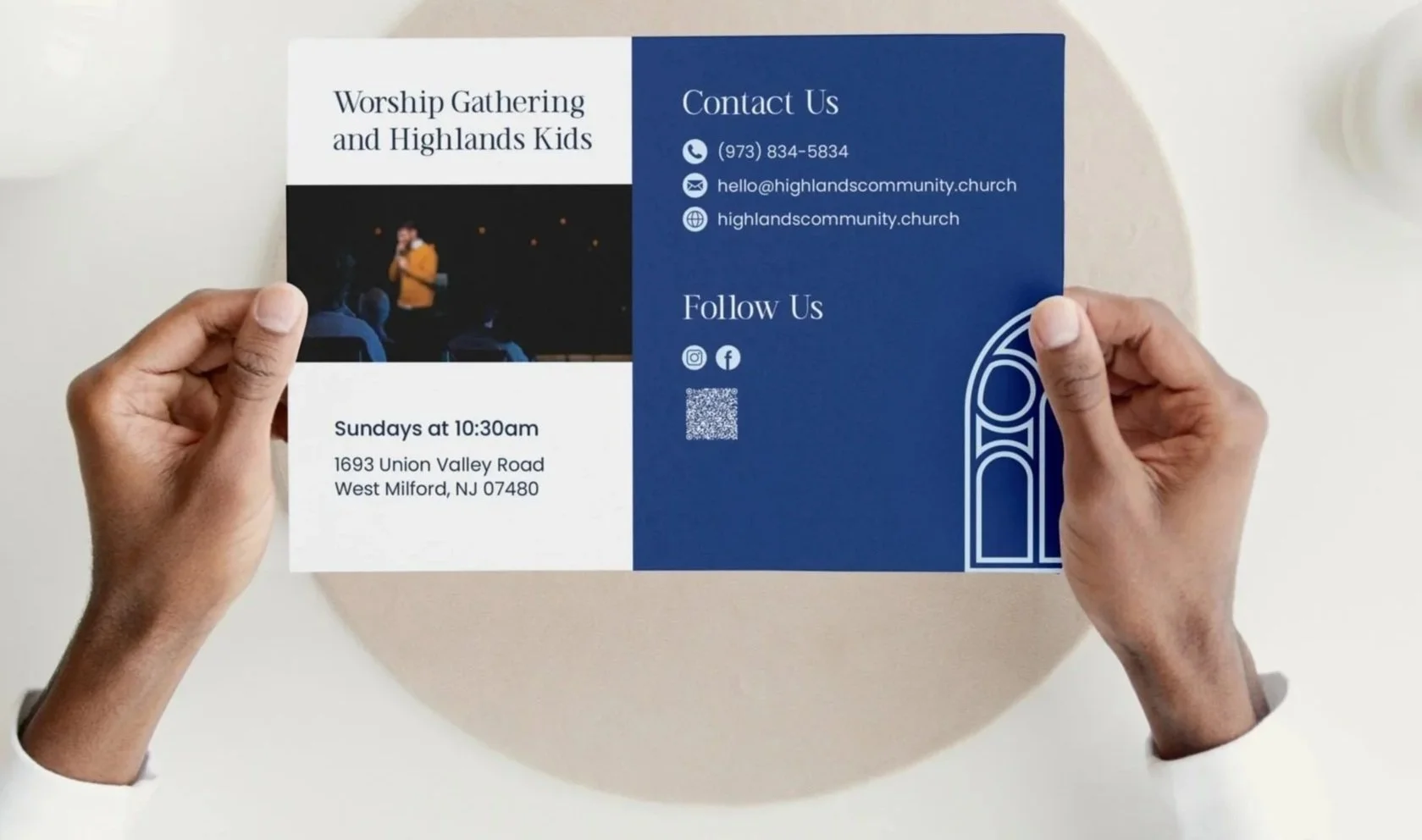
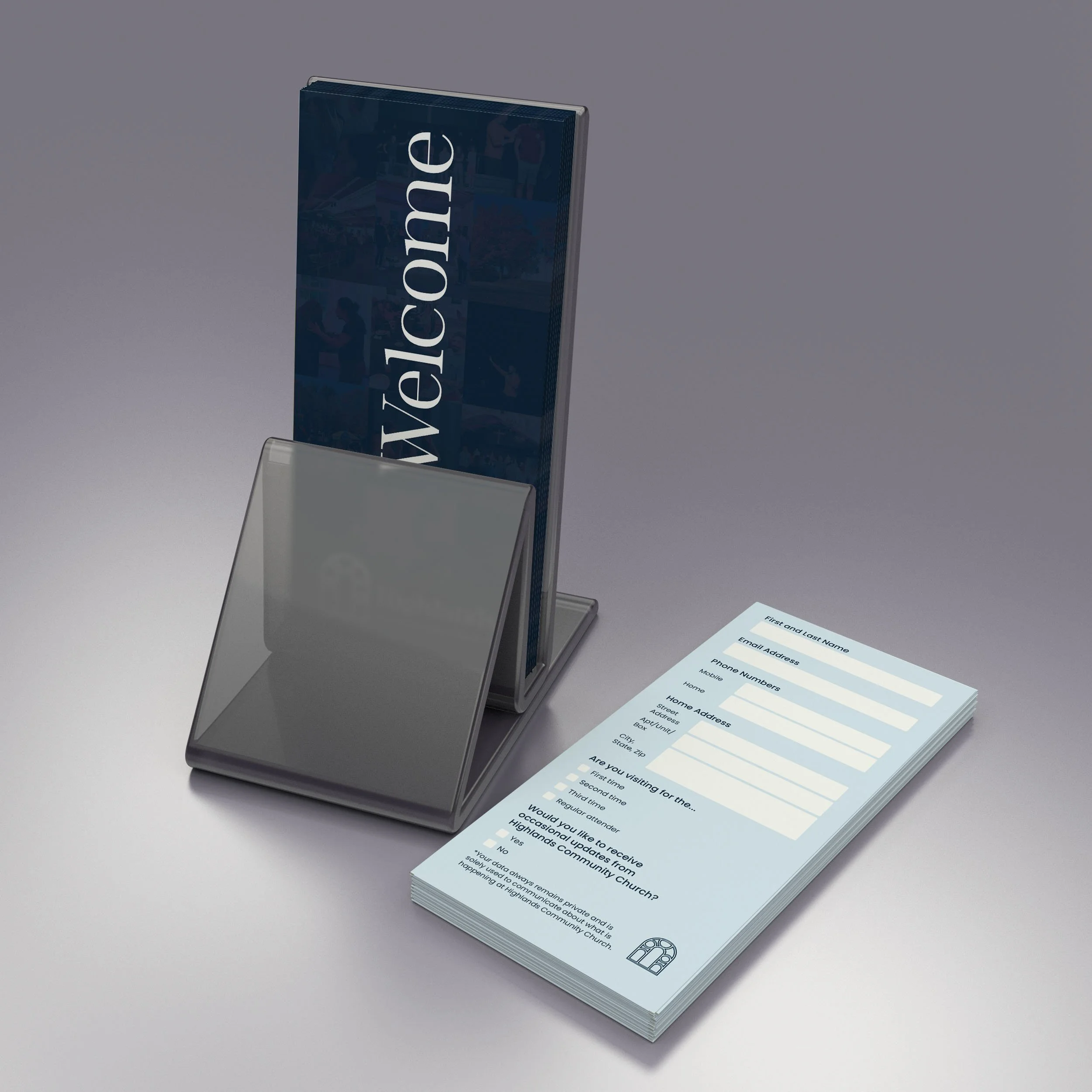
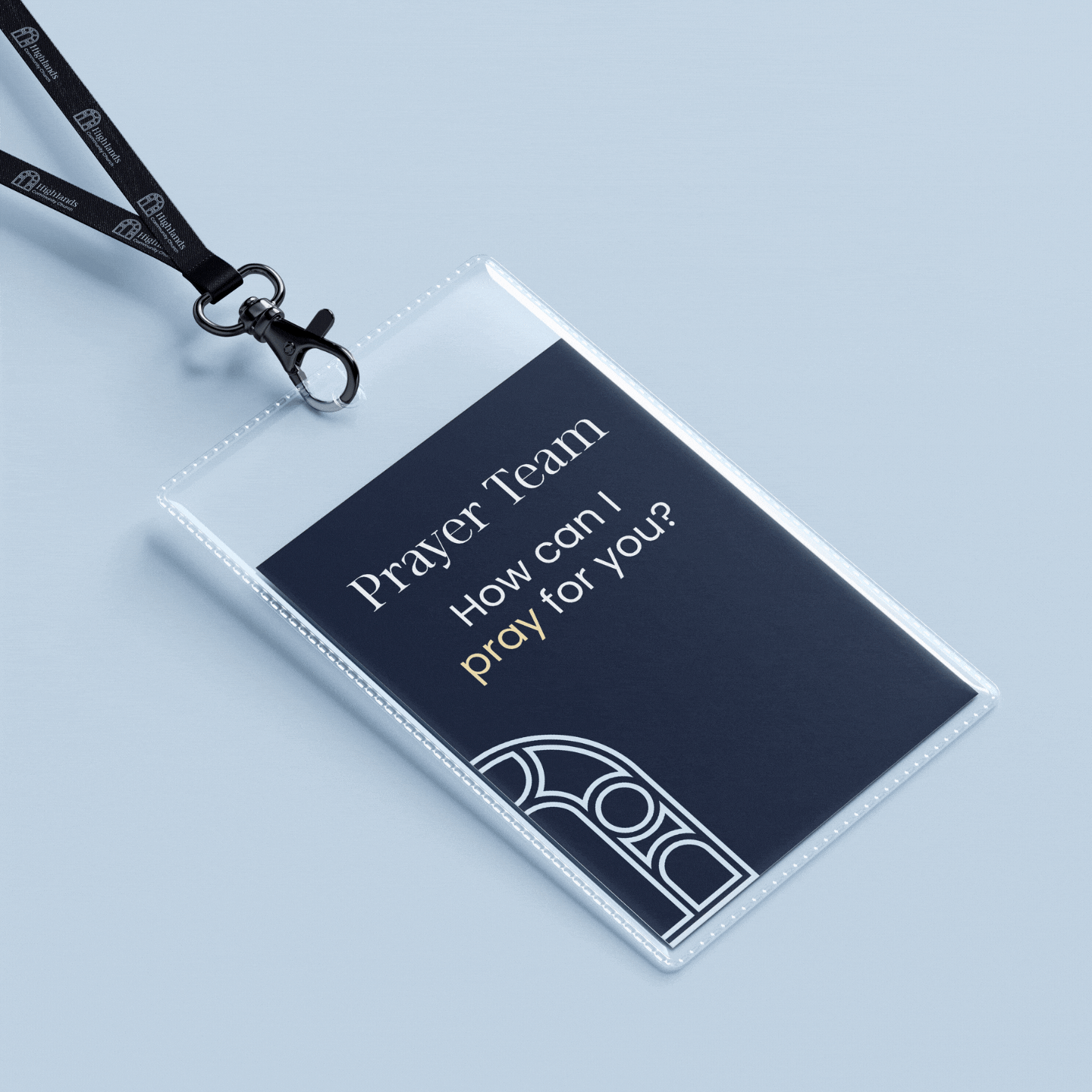
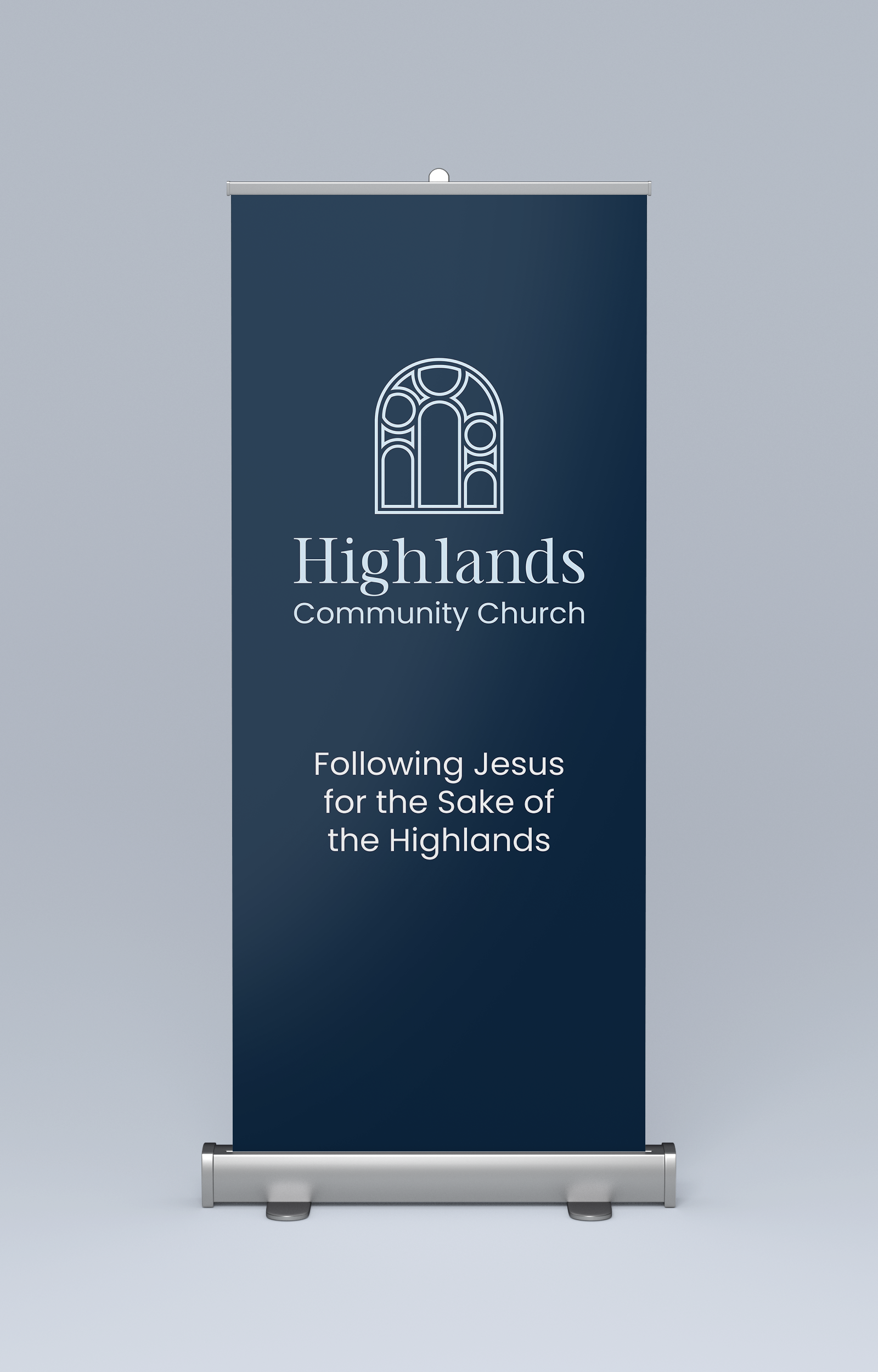
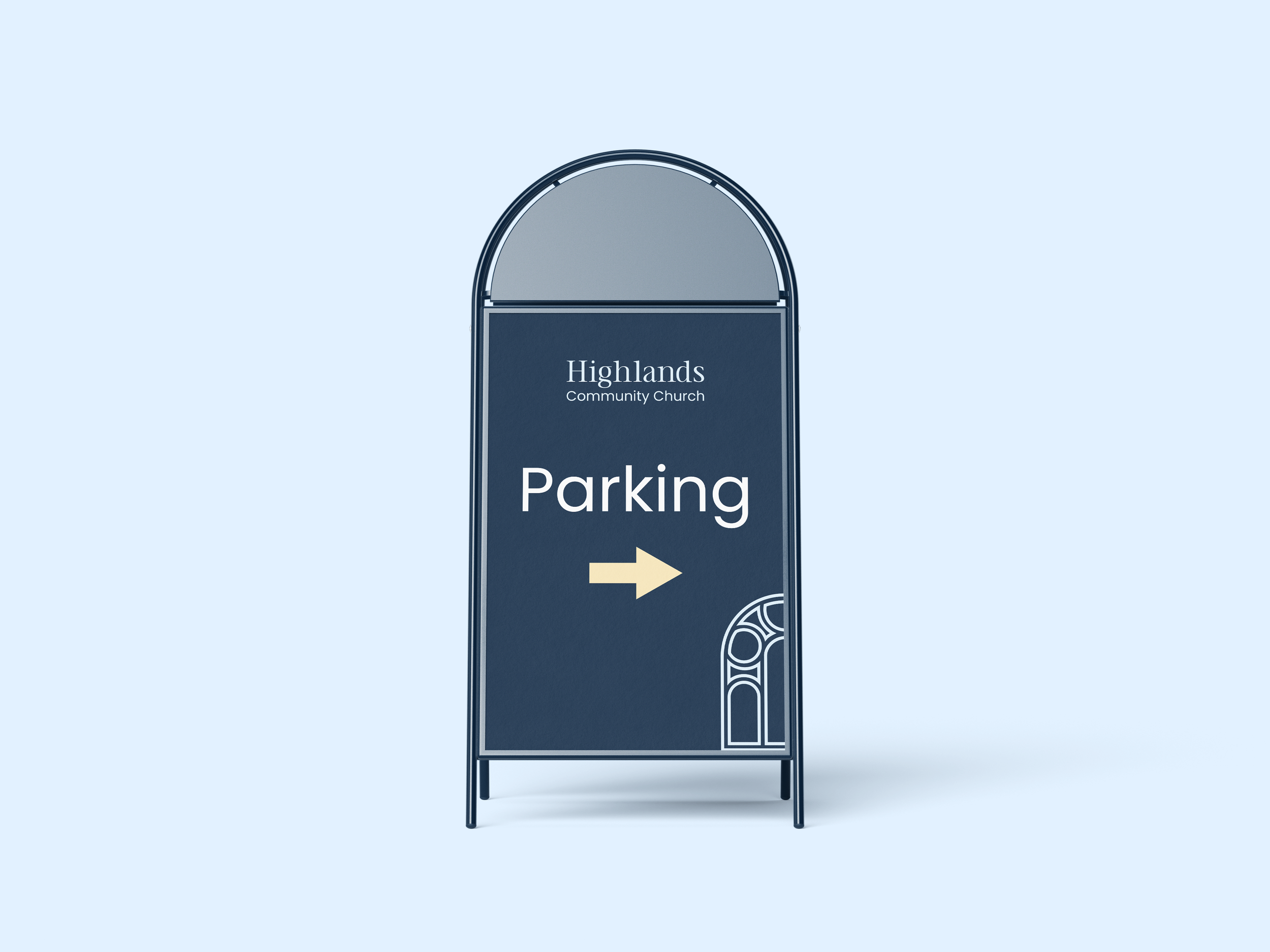
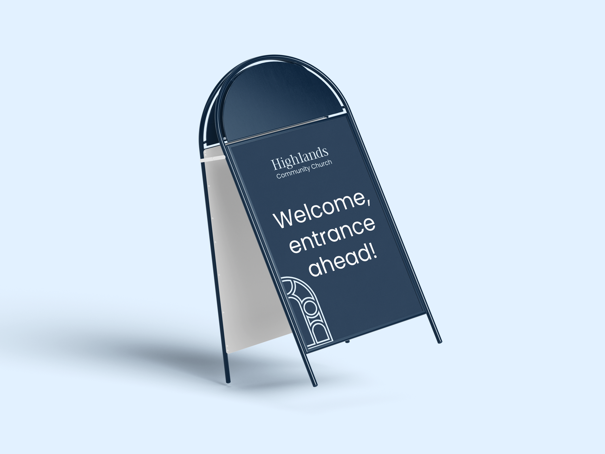
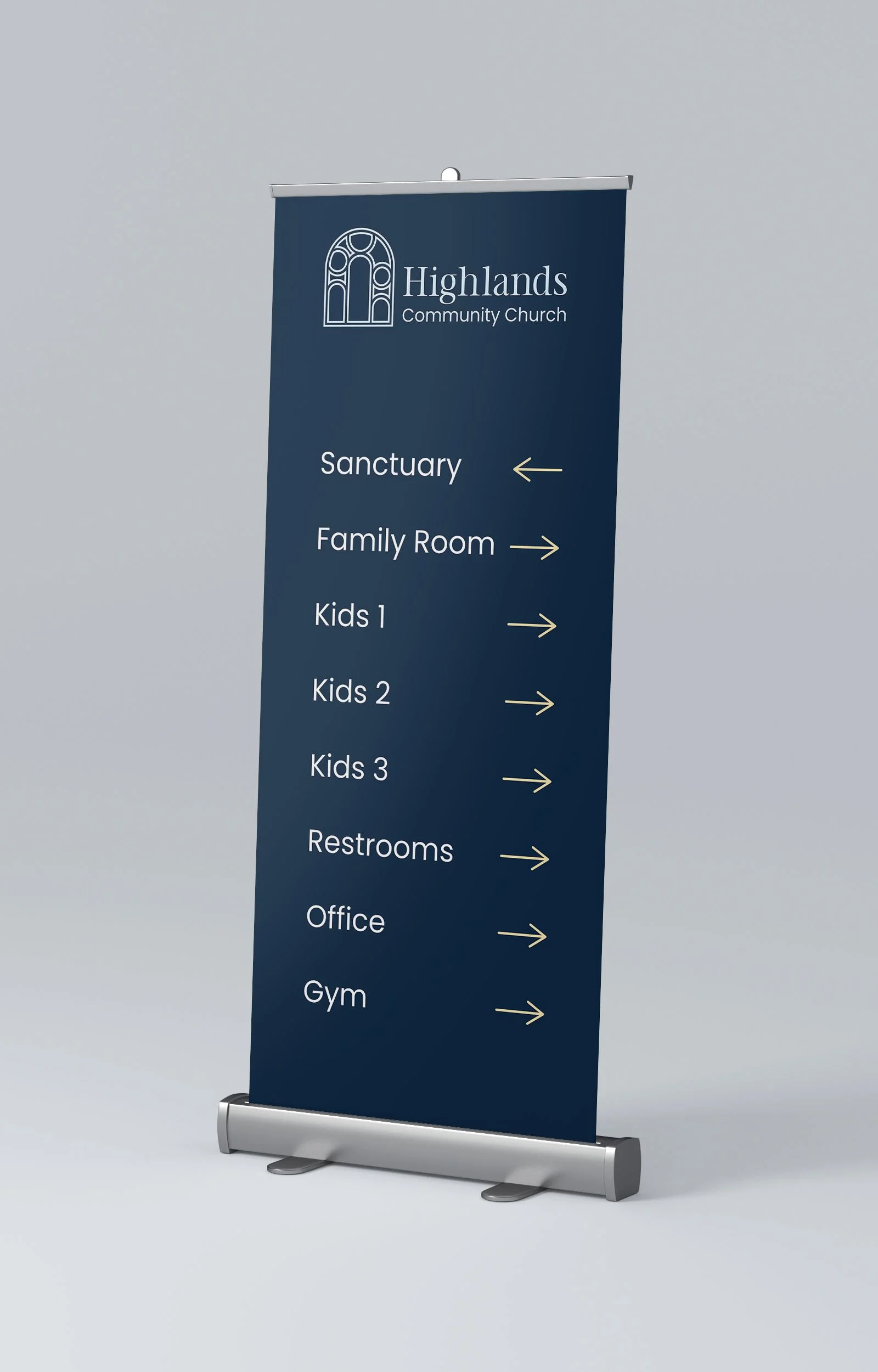
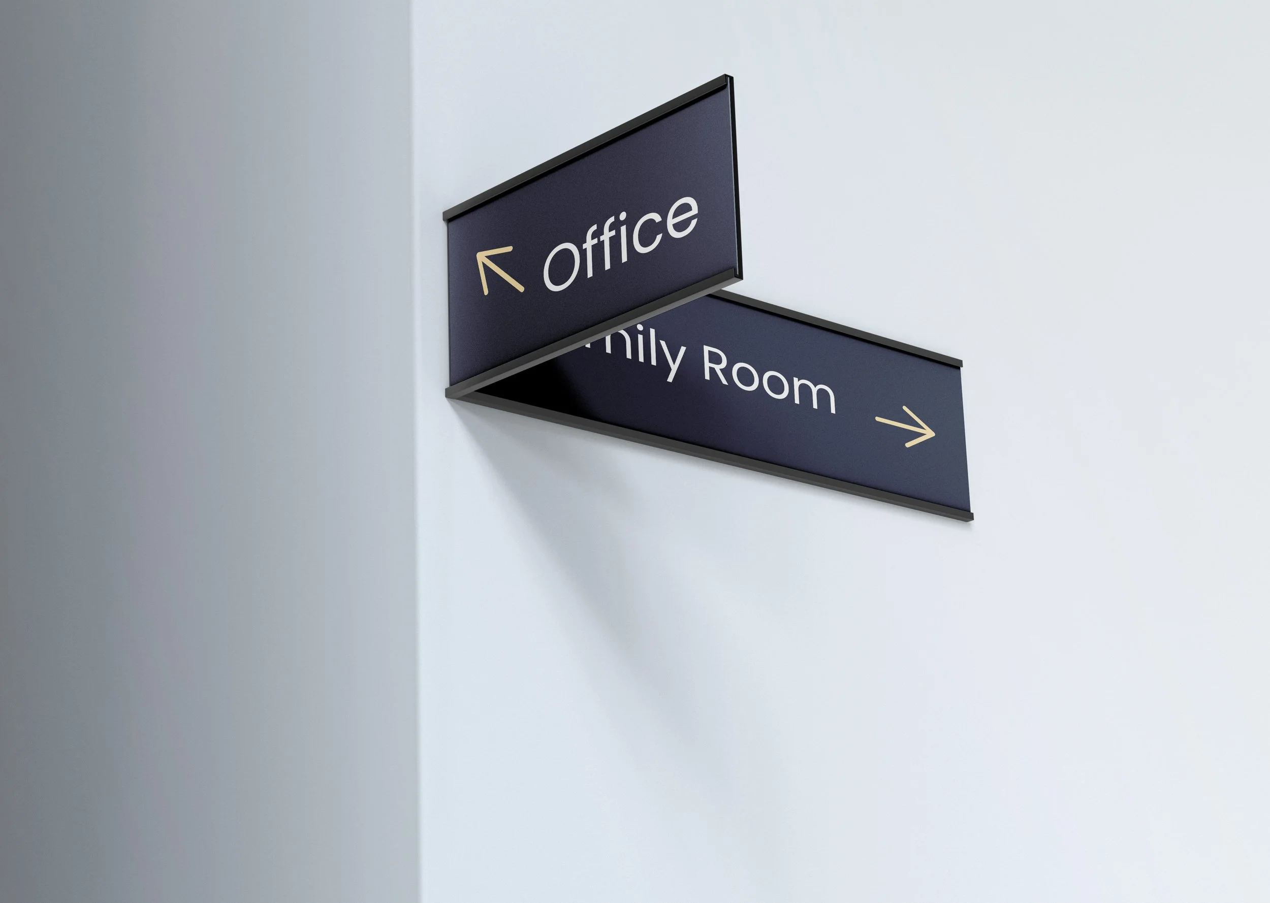
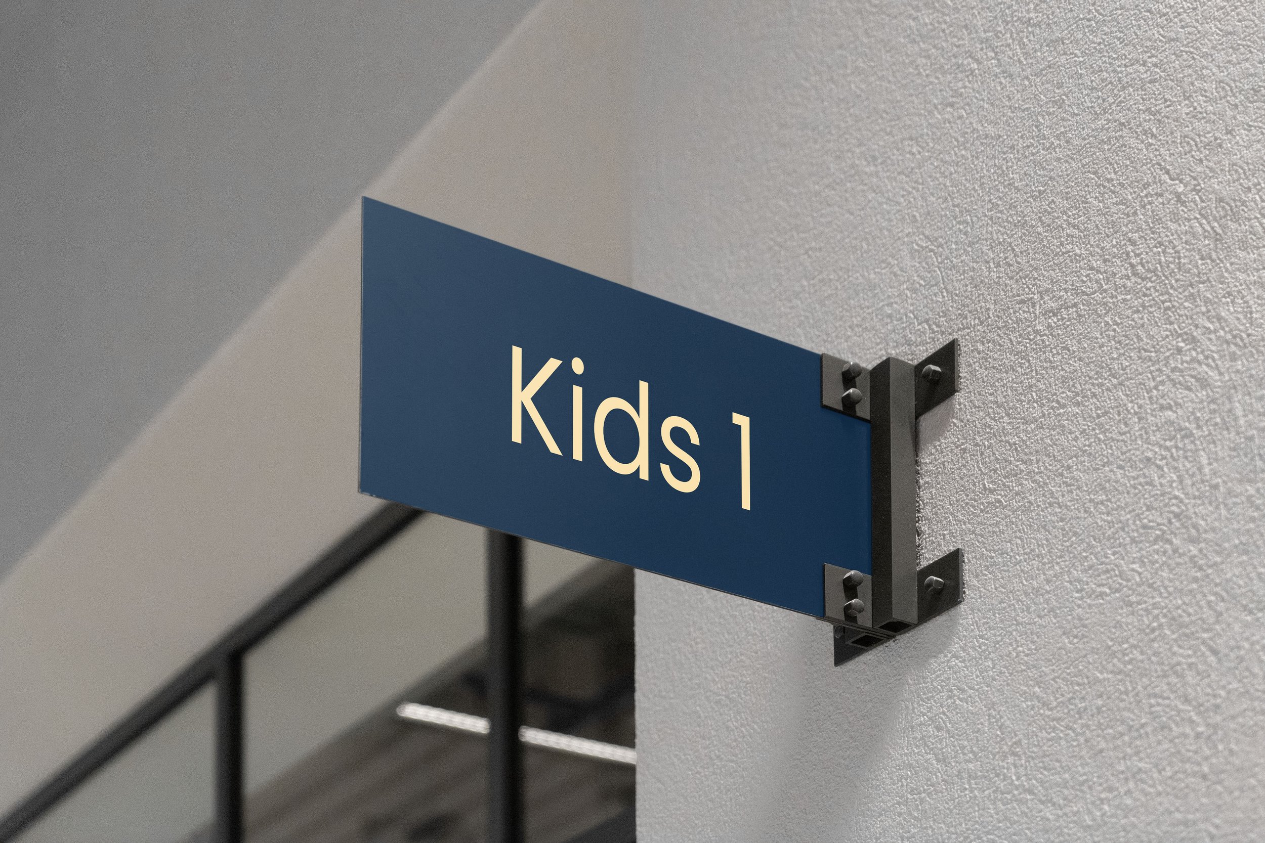
Print Collateral
From business cards and stationery to way-finding and ministry team materials, each printed collateral was designed with a clean and ednuring aesthetic in mind.
Print materials reflect the brand’s personality through clean layouts, thoughtful use of whitespace, and repetition of the arch shape in the brand mark to create a cohesive look and feel.
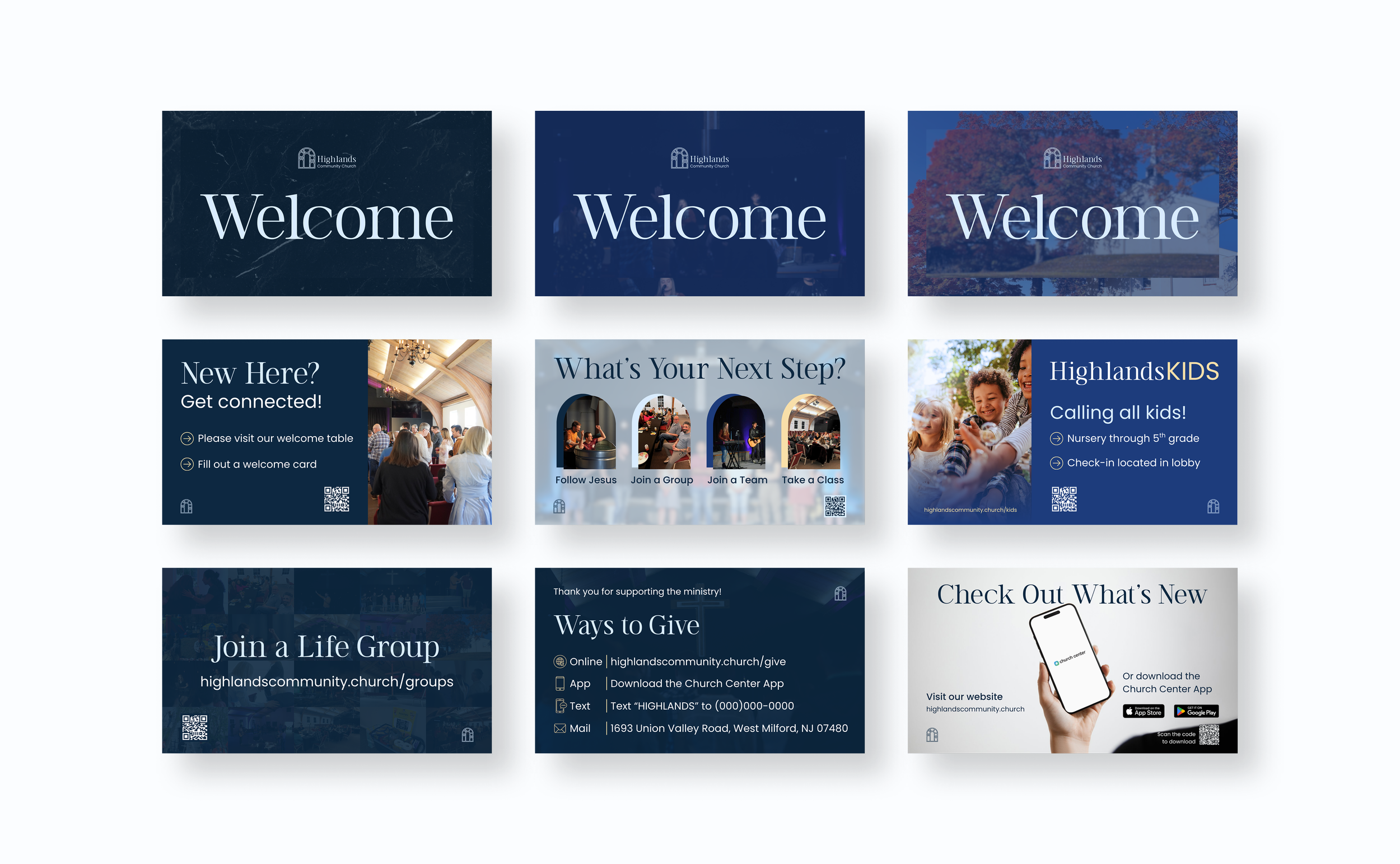
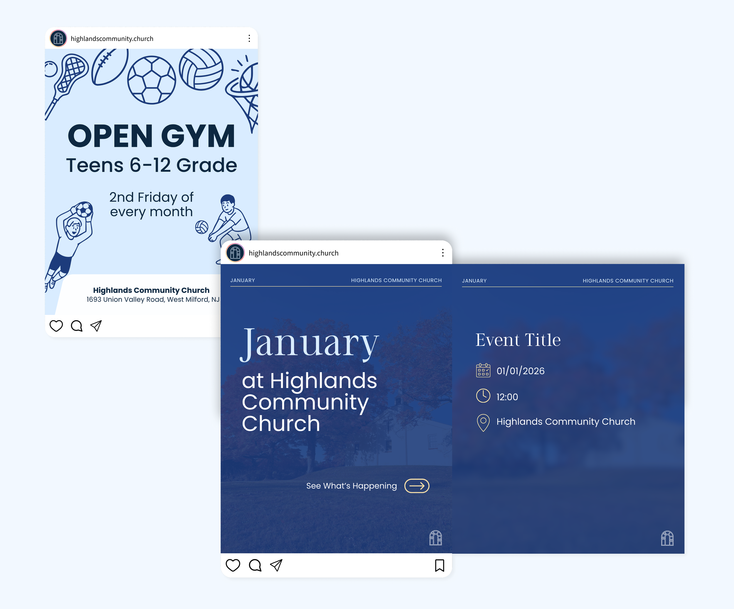
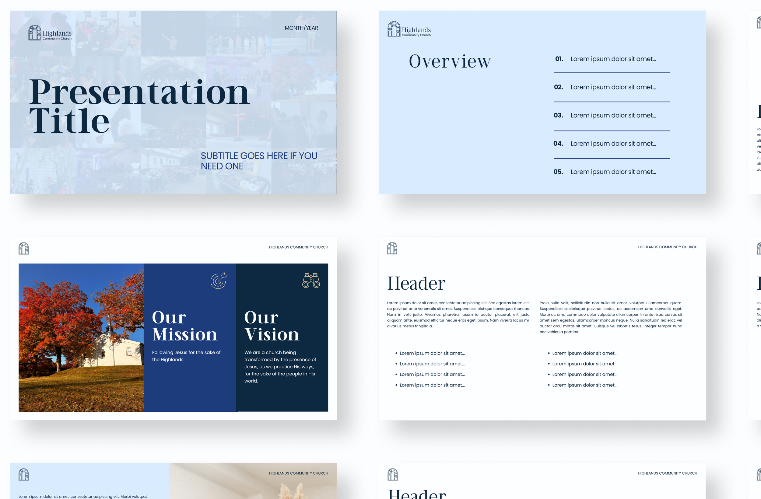
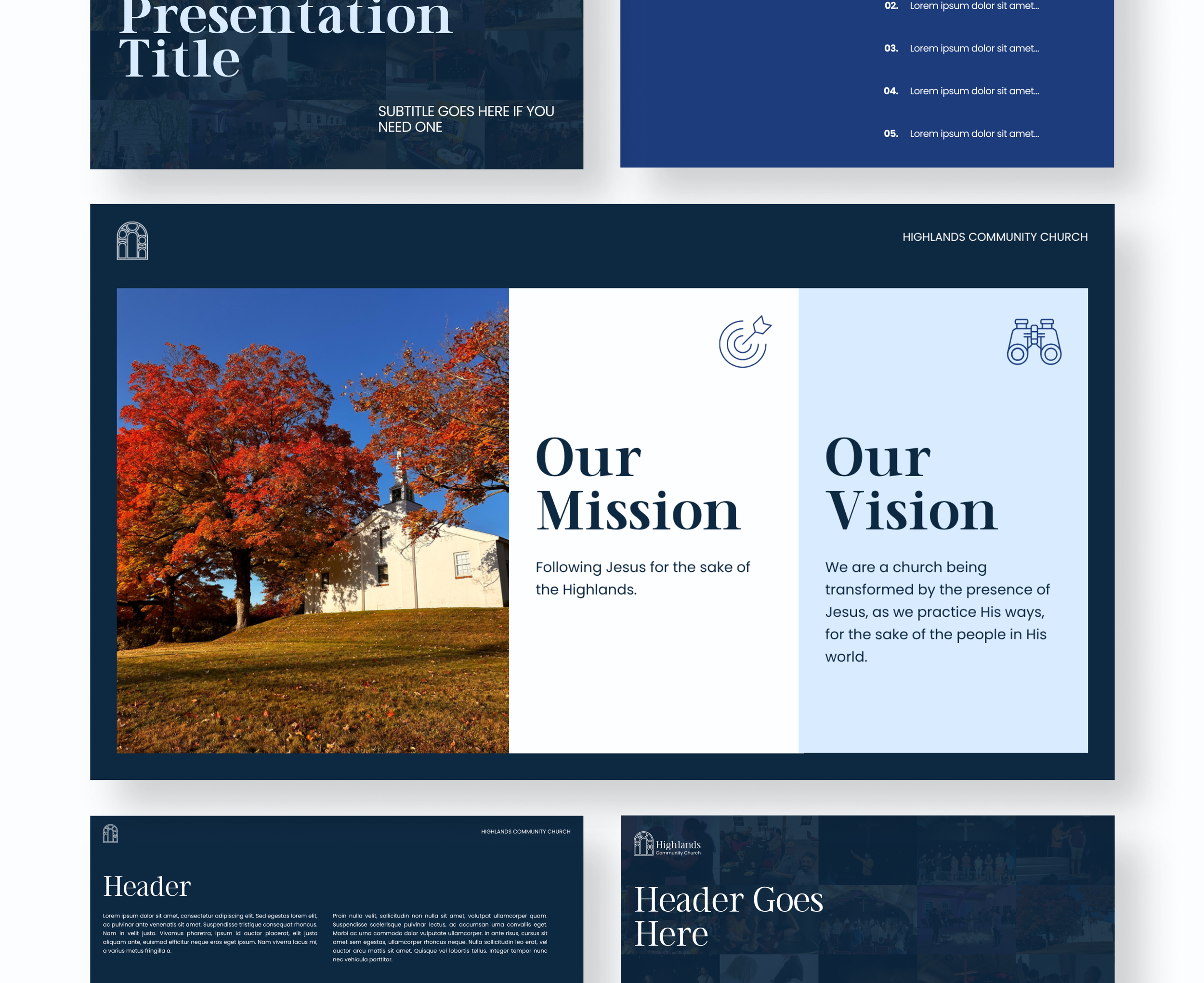
Digital & Web Design
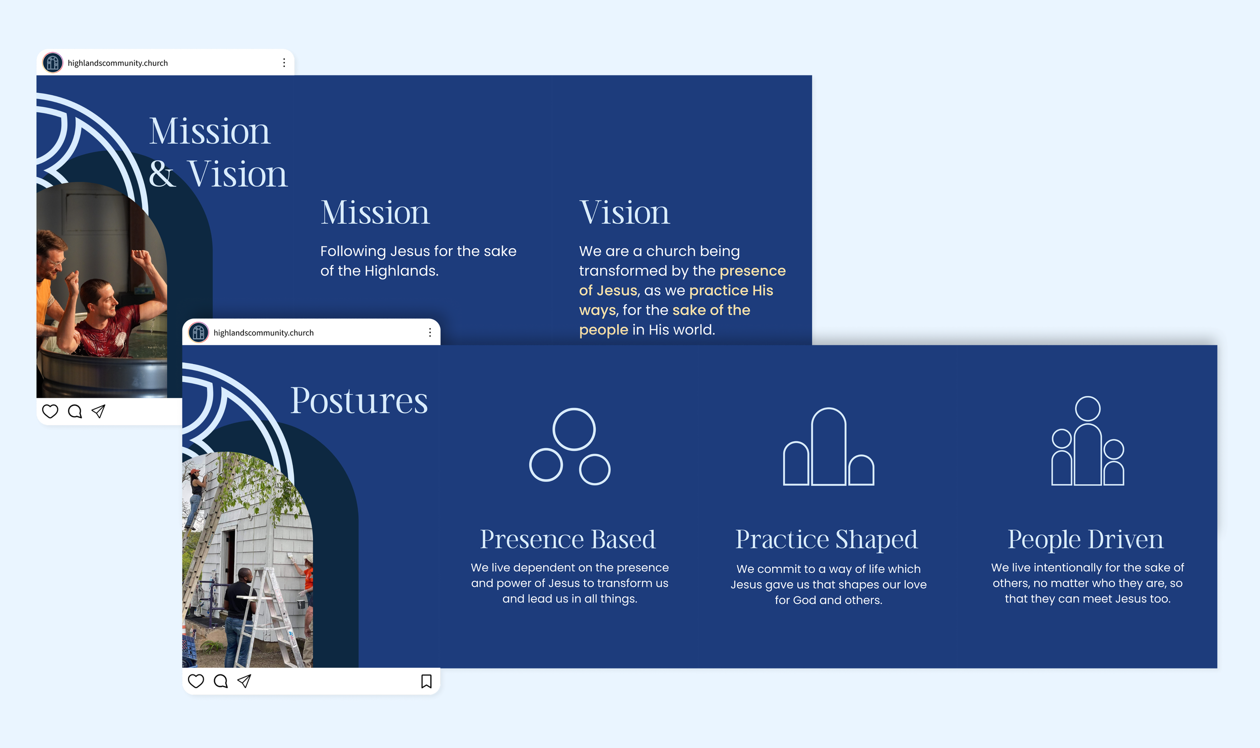
The digital rollout extended the brand identity into a cohesive online and on-screen presence. The website design balances clarity and visual consistency, while also ensuring it has a user-friendly experience from start to finish.
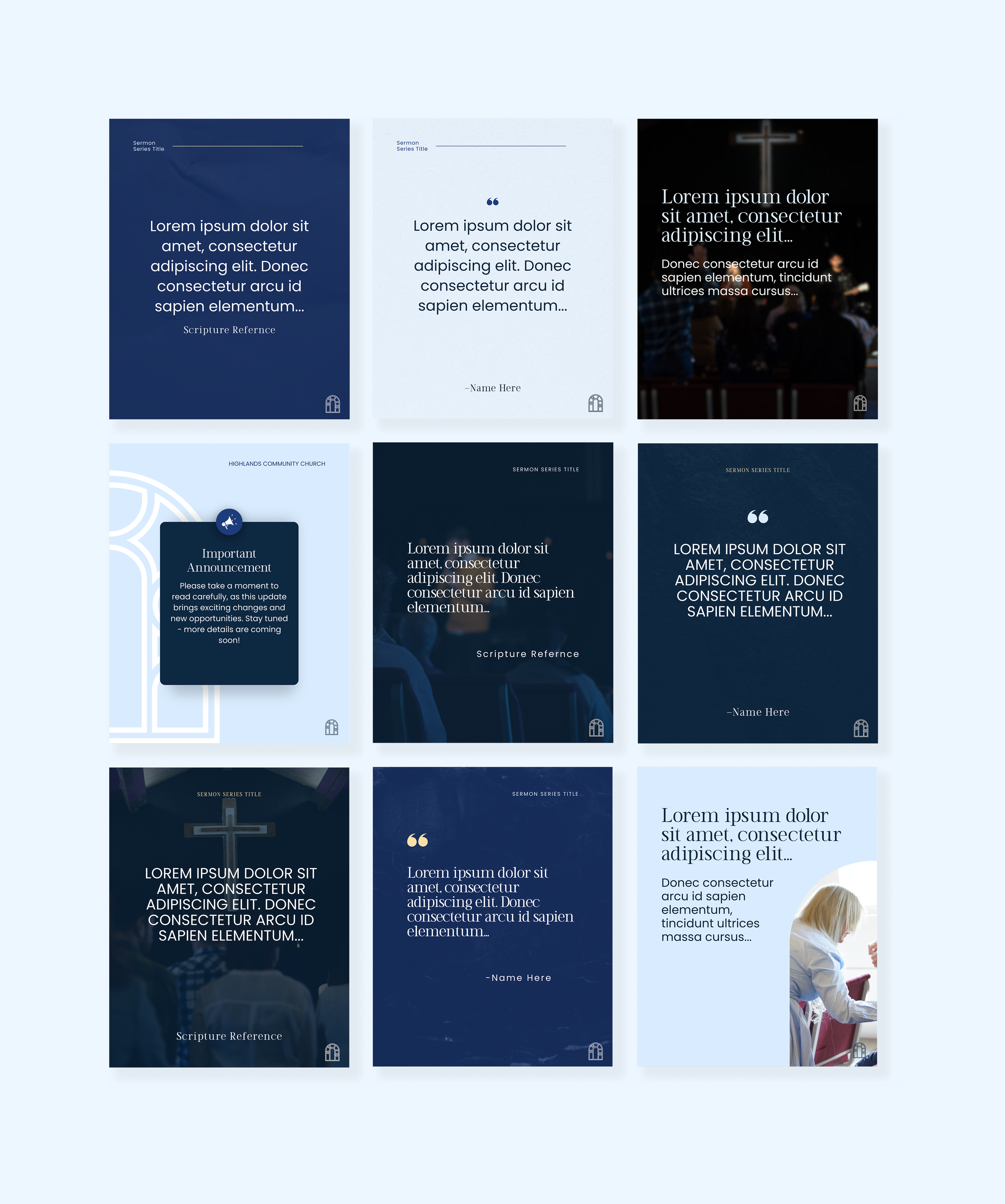
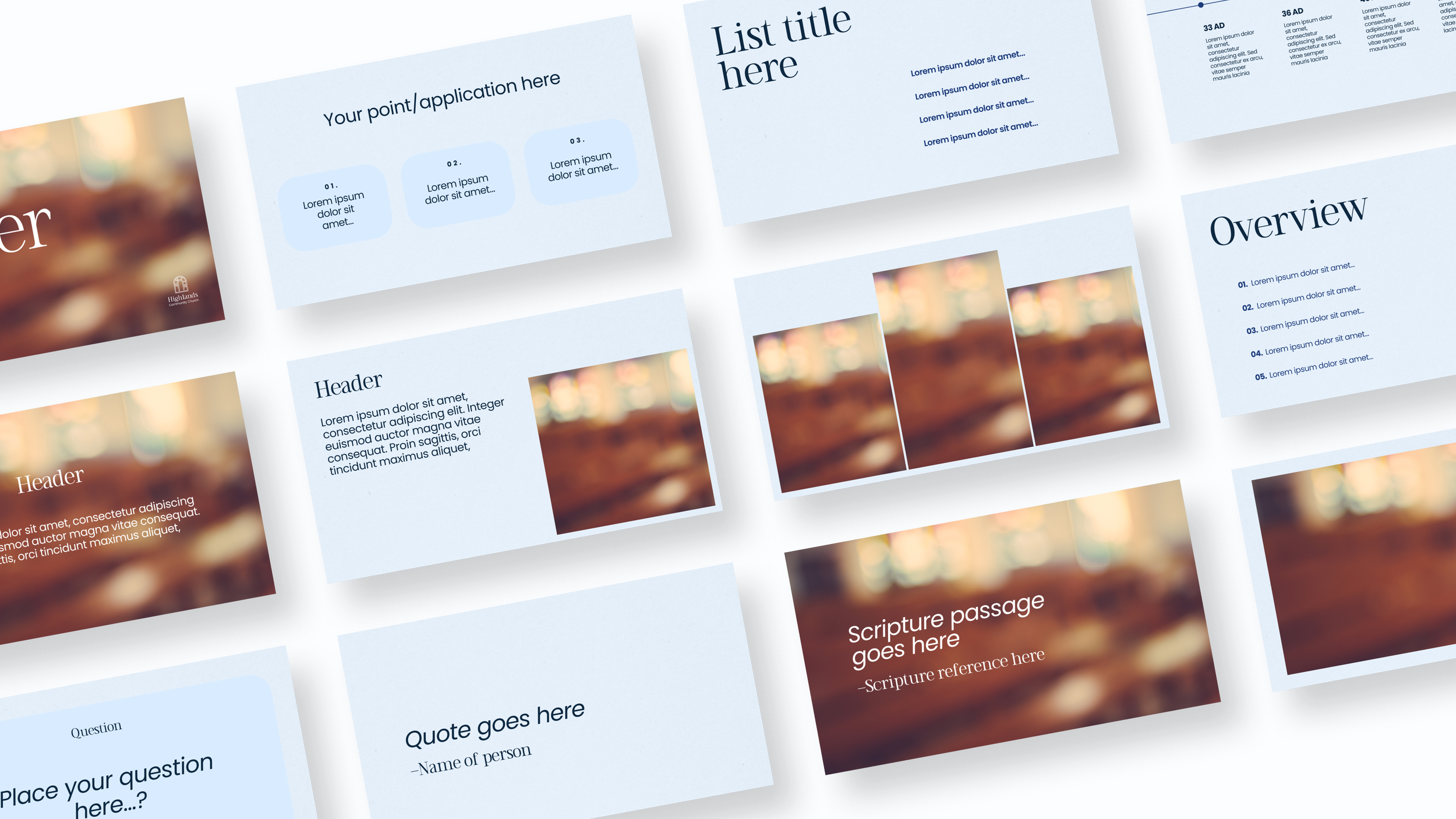
I created a full suite of custom branded templates — from social media posts and sermon series graphics to meeting presentation decks — for the client’s internal Canva account. These templates empower the team to easily create on-brand content and help set them up for success.
Every digital touchpoint — from social media graphics to web banners — reinforces the same consistent look and feel.
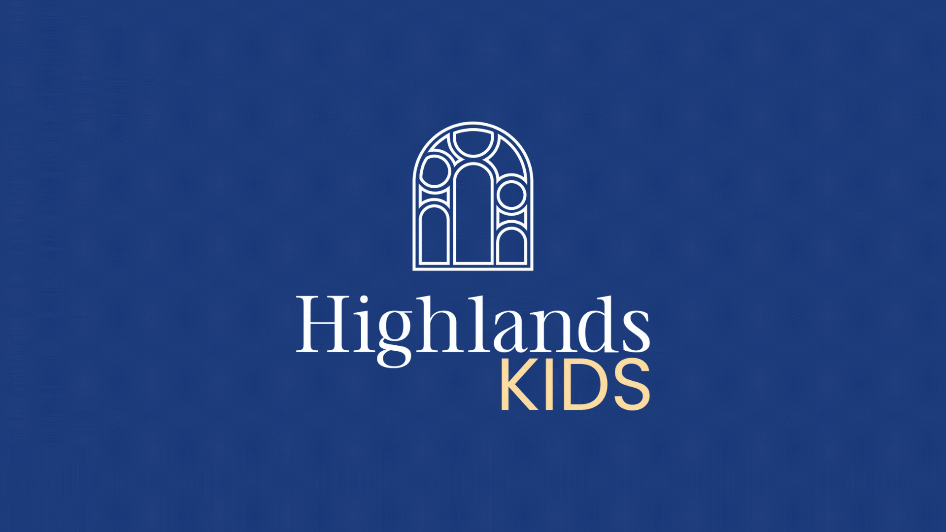
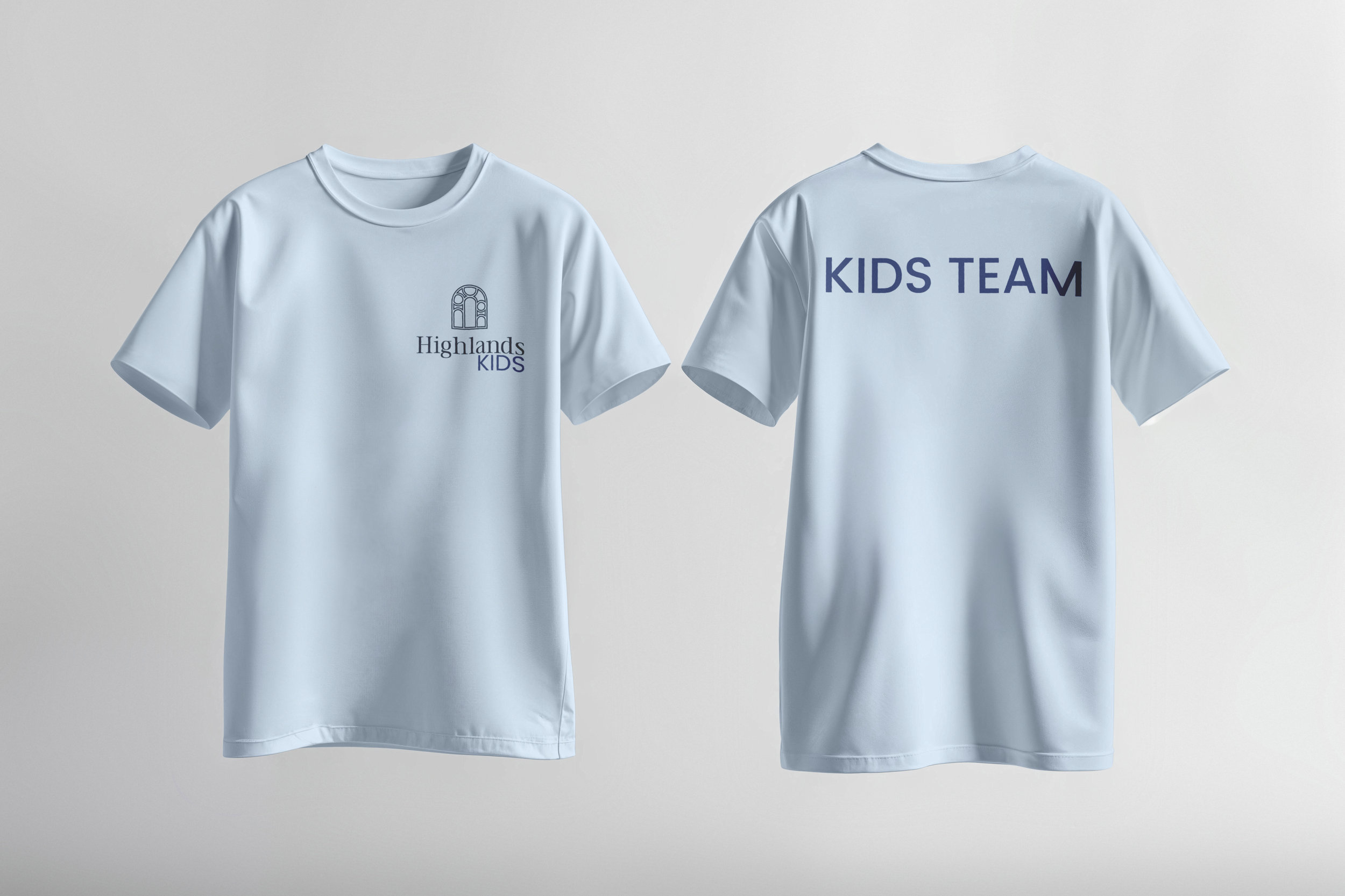
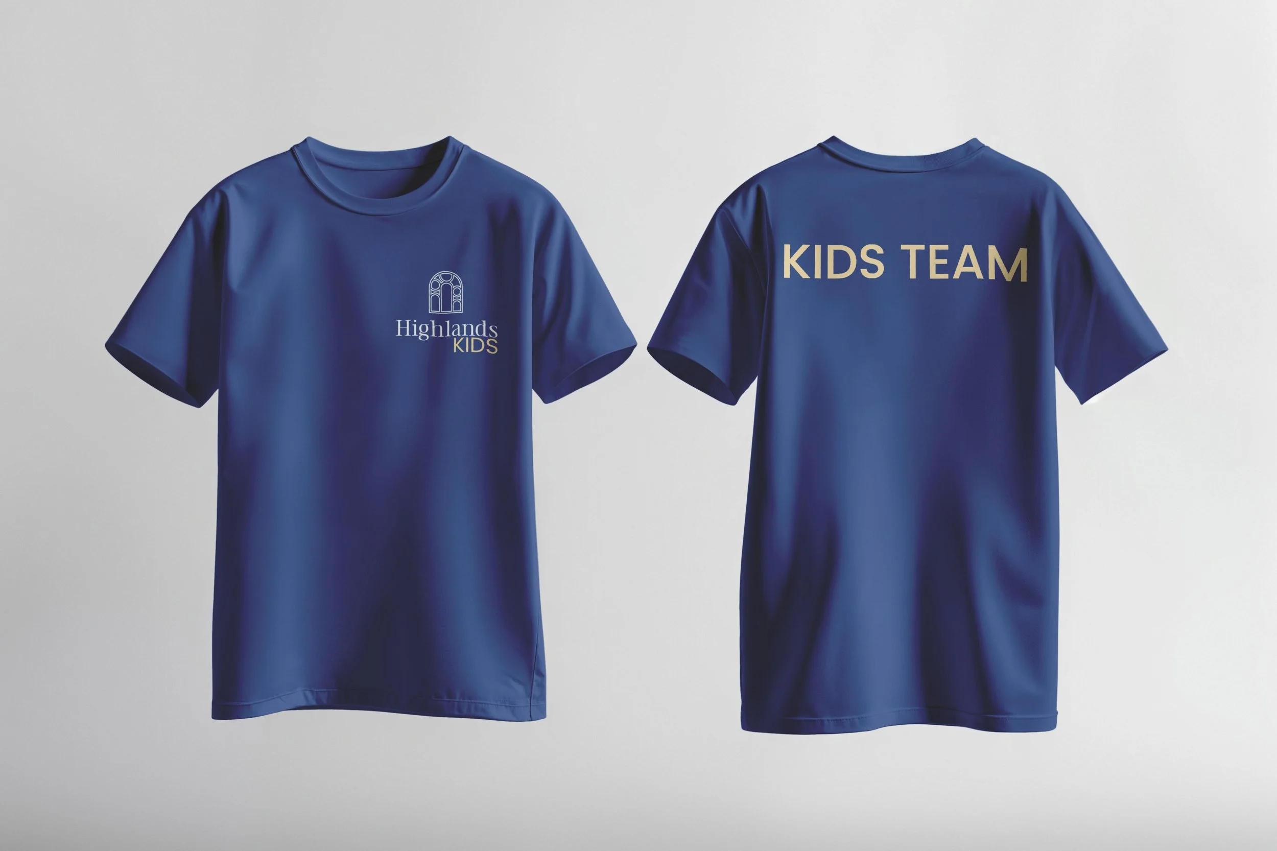
Sub-Brand Logomark — Highlands Kids
To extend the core identity system, I developed a sub-logomark for the church’s Kids Ministry. The goal was to create a mark that clearly connects to the parent brand while introducing a sense of playfulness and approachability suited to a younger audience.
The design retains the main logo’s overall structure and color relationships, ensuring brand cohesion, but incorporates brighter tones and a playful layout to make it feel distinct and age-appropriate.
This sub-logomark allows Highlands Kids to stand confidently within the overall brand family — instantly recognizable as part of the same church identity, yet perfectly tailored to its unique community and purpose.
The Result
The final identity system delivers a cohesive, welcoming, and timeless brand presence. Every detail — from logo to online experience — works together to create recognition and trust.
This full brand rollout reflects the client’s heart and mission and helps position them for growth across all platforms.